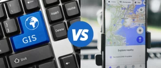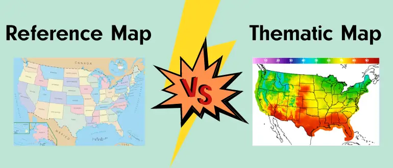
As we move into GIS (Geographic Information Science), we will often start working with a reference map of some sort, setting borders or marking landmarks. Then, we layer thematic maps over that to help you investigate a problem. Reference maps tell us what is there. Thematic maps tell us how it is there. For example, a reference map may show you all the towns and cities in Maryland. But a thematic map may tell us the median incomes of these towns, or the percent of households owning two or more cars.
Reference and thematic maps
Knowing the different map types and the purposes they serve is important when selecting or creating a map. If I am trying to find driving directions, I would use a road map that is a reference map explaining features of interest to a driver. This map answers questions about where things are. If I am forecasting the weather, I would use a weather map that includes items like air pressure, wind, and temperature. A thematic map show information that is likely to change over time and is focused to help answer a specific question. This question is not about the map but about how themes are displayed across space. A map showing cold across Wisconsin in different shades of blue works against the background of a physical or political map

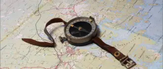
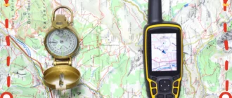
Reference maps are maps that help us determine features of the world in which we live. These maps show a selection of physical and/or cultural features through a map. These physical features include rivers, mountains, and geology. Cultural features include towns, roads, and time zones. Classrooms and atlases include reference maps to teach students about geographic features or to help you navigate through them. I remember learning the states from an old pull-down political map in the classroom. Someone had circled the word Florida, likely out of hopes for a vacation. Specialists, like geologists, also use several reference maps to learn about topography and help see what is underground. You can even help them by becoming a GIS specialist to create maps of the world together with GIS. To become such an expert, you must take a course and get the appropriate specialty and a certificate to prove it. If you’re having trouble deciding, I’ve reviewed the best online GIS certificate programs here. I hope you will find it useful.

Thematic maps aim to communicate data about space and distribution to people.
A thematic map explains a topic that you want to know more about in a geographic context. GIS has expanded the use and utility of thematic maps. Each layer in the program can combine a different theme to the user. In this one could look at income over a political map showing boundaries to see where rich and poor people live. Then add in a layer of topography if you suspect poor people live in areas that flood.
Differences between reference and thematic maps
Often, a map will have characteristics of both reference and thematic maps. Weather maps will focus on the theme of weather events, like temperatures and wind. However, they also show physical and political features to enhance readability. When people find their town or county on the map they are better able to interpret how the weather will affect them. Here is a great video that discusses the difference between reference and thematic maps.
We will discuss 18 commonly used map types. Seven are reference maps and 11 are thematic maps. Although I have them separated, each category will blend with the other. Can you find reference ideas in thematic maps – and vice-versa.
Reference Maps
Reference maps show the reader what is where. They once illustrated qualities that do not change, or that change very slowly, but with GIS they can more often represent changing or fluctuating data points like the flood stages of a river.
- Political maps display a selection of human-made features such as borders and cities. They also show some physical features, such as rivers, but do not show topological features. A world map showing countries and major cities is a political map, as is one showing counties within a state. Political maps are often used for teaching or display. However, they can be used to assert international border claims.

- Physical maps illustrate the features of land and water within an area. They highlight such physical features as rivers, elevation and water depth, deserts, and such. Physical maps help us visualize what the land actually looks like by incorporating a description into the map. These are used for teaching, urban planning, and traveling.

- Road maps are highly detailed maps, with features selected to be of interest to a driver or someone finding their way. These maps highlight roads and intersections. They are not likely to exhibit additional information. Today, paper maps are disappearing because GIS technology can present maps that change as we drive while a voice tells us what direction to turn.

- Topographic maps focus on showing the elevation of the earth’s surface. They do this through contour lines (or sometimes color gradients) that link places with the same elevation. They often include names of natural features, such as hills and hollows, and political features, such as towns and roads. These are useful for hikers, planners, and natural resource extraction.

- Time zone maps divide the world into 24 time zones, the same way we divide a day into 24 hours. These lines run from North to South Poles, generally straight but forming some interesting bends to keep countries or island groups in the same time zone. In a world of online meetings, I use time zone maps to translate London and Vancouver times to my own Chicago time.

- Geological maps show the surface of the earth if someone pulled off the soil and buildings. They mark the rock types that underlay the soil and show select geological features. Builders and planners use these maps to find a solid base on which to build. Disaster planners use geological maps to better deal with natural threats such as volcanoes and earthquakes.

- Zip code maps show a different type of political feature – the mailing zones last zip codes. Zip code areas can be as small as one building in a city or expand over large areas of the sparsely-populated countryside. Any business that uses mail for advertising or delivery will be using some form of zip code map daily, although it may be hiding behind other software.

Thematic Maps
Thematic maps help us ask questions across an area of space. They focus on one topic to make a point, or multiple ideas to help support analysis. Thematic mapping sits at the heart of GIS, which allows us to use thematic maps to analyze and understand complex interactions of data.
- Weather maps are the thematic map most of us are very used to seeing. They display details of weather across space. These details can (but do not have to) include precipitation, wind, temperature, fronts, and more. Many people use weather maps daily as part of their morning preparations for the day to come.

- Heat maps show temperatures across a map. We are used to seeing these during freezing spells and heatwaves as part of weather reports. The depth or darkness of color represents greater temperature extremes. Heat maps can show other things than temperature, such as what areas of a web page are touched the most. Heat maps are great at showing overall trends, but the creator must be careful about the use of color.

- Income maps illustrate the distribution of money earned. Mostly, these maps use the median income for an area, but they can use other data. Income is a common type of data used in mapping, but other measurements (such as years of schooling or average age) can be mapped in the same way. Scholars, analysts, and activists use these maps to better understand and deliver services to people who need them.

- Resource maps show the distribution of economic goods on the landscape. These goods can be tangible like coal and corn, or represent abstract things like production capacity and labor. These maps can be made specific, perhaps to show a lumber company where timber is. They can also be general maps, showing the major resource in each country in Latin America.

- Choropleth maps show colors in areas to communicate where a variable occurs in place. These maps can show the results of an election, the spread of technology, or the ratio of cows to people. These maps are good for showing densities and ratios, but bad for nuance because they generalize over areas. Choropleth maps sound more difficult than they are.

Check out this video on “How to make a choropleth map”
- Chorochromatic maps are also known as qualitative area or area-class maps. These are much like choropleth maps, except they ignore political boundaries. These measure a class, such as vegetation, that cannot be converted to a ranked numerical system. Chorochromatic maps are used to show patterns such as dominant vegetation, soil, or language.

- Proportional (or graduated) symbol maps are related to choropleth maps, but instead of color they show the intensity of data through the size of a symbol. This allows the map to show a second data them through the color of the symbol. This framework illustrates quantities better than ratios. This proportional symbol map shows the outcomes of the 2016 election, weighted by state population size.

- Dot distribution maps use a dot (or small symbol) to represent each case of the measured data and where it is located on the map. These dots can represent more case studies, a dot can represent 10 or 100 cases. A dot distribution map is great to show an accurate geographic distribution of data. One must create these maps with care. For example, if a dot represents zip code on a city map, you won’t see a per house distribution. Look here for a neat dot distribution map in which dots are McDonald’s restaurants. East of the Mississippi you are never far from a McD’s unless you live in Maine or West Virginia.

- Dasymetric maps are similar to proportional symbol maps. They show dots representing data over a geographic background. But a dasymetric map has a better way of representing populations, moving dots to where people live makes a more accurate map. This method requires an additional step to adjust the dots to density. On this website, the USGS shows some dasymetric population maps.

- Cartograms rescale areas on a map to represent a count about a feature. You may have seen this in a world map where the size of the countries represents population – with a fat India. These maps are great at showing numbers, but the reader has to have a basic understanding of maps in order for a cartogram to make sense. Here you can find the famous Washington, DC Metro cartogram and compare it to maps that show distance and actual location.

- Isorhythmic maps include contour maps and other maps that use lines to join points of equal value. Color fills the areas between the lines, which makes it easier to see where the values are the same. An isorhythmic map works well to display data such as air pressure on a weather map or plant hardiness zones on a seed pack.

- Flow maps are maps that use symbols to represent movement. They most often use arrows that gain thickness or color depth to represent larger flows. These lines are like the symbols in some of the other maps discussed here. Flow maps can show migration patterns in humans or animals, or the direction of a storm heading across the country. You will see a number of these maps in social and biological sciences textbooks. The lines are vector data in a GIS program.
The dynamic wind map, showing real-time wind in the US is an interesting use of a flow map. It’s also one of my personal favorites.

Conclusion
Reference vs thematic maps is an everyday question for a GIS student, analyst, or programmer. Reference maps are used to communicate location on more static data points. Thematic maps communicate information in a geographic display where the map part is essential, but not the main idea that the map communicates. For a quick review on reference vs thematic maps, check out this video.
You can also check my article discusses the best laptops for running GIS systems here.